Ng illuminates research with data visualization

Which countries are similar in their web use patterns? What are the peer-to-peer dynamics among elite journalists in Washington, D.C.?
The findings to such data-driven questions can be demonstrated visually, with the emerging field of data visualization. In fact, Yee Man Margaret Ng, assistant professor of journalism, spent her first year here working on research projects with fellow College of Media faculty members to answer those questions.
“The research that I work on is mostly related to using computational tools to solve social science questions,” said Ng, who has previously held positions at Pew Research Center’s Data Labs, National Geographic Magazine, and The Seattle Times. To help make sense of big data, Ng uses computational methods, such as network analysis and machine learning, to discover social patterns and connections. “I can code it or visualize it.”

Visualizing the world’s use of the web
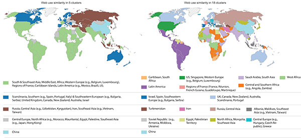
Ng and Harsh Taneja, assistant professor of advertising, co-authored an article “Mapping User-Centric Internet Geographies: How Similar Are Countries in Their Web Use Patterns?” which will be published in the Journal of Communication this October. (View a poster of their research with an animated map by Ng.)
Ng obtained web use data for 174 countries, calculated their similarity score, and created different network graphs and choropleth maps (maps proportionally shaded by themes) to see which countries are more similar to each other in web use, and which are outliers. In addition to how countries cluster together in term of web use similarity, Ng and Taneja also examined what factors play a role in shaping the World Wide Web on a global scale.
For example, one might guess that the country most similar to the United States in web use patterns is Canada. But Ng and Taneja’s research is able to factor how smaller countries contribute to major online geo-linguistic formations. They uncovered that Singapore was closest to how the U.S. uses the Internet, presumably due to their similar language composition. Singapore has a relatively small population of Internet users that makes it hard to foster a self-sufficient domestic online ecosystem, but needs to rely on Western content.
“Harsh is a very good scholar to conceptualize ideas with, and [to determine] which methods to use,” Ng said. “I bring my expertise in how to analyze and how to present the results. Our skills complemented each other.”
Visualizing journalists’ patterns on Twitter
For another project, Ng and Nikki Usher, associate professor of journalism, presented their research on social media conversations between elite journalists at Washington, D.C., this August at the Association for Education in Journalism and Mass Communication conference.
Using network analysis, Ng studied how those elite journalists formed their own communities on Twitter. Looking at two months of Twitter data, she tracked how often they mentioned, replied, and retweeted each other.
On Twitter, how often journalists interact with each other can indicate that they have formed a community. Using network visualizations, Ng could detect who formed their own professional circles.
“There is a real concern of those elite journalists forming circles with those who share similar orientations,” Ng said. “They are the ones responsible for framing and conveying all the political news. So we are interested in how their knowledge and idea is formed during the process [of forming a community], and then we want to see how frequently they interact with each other.”
For example, one of the clusters they discovered through Twitter data-mining is what they call an “elite legacy community” that includes journalists from The Washington Post, NBC News, The New York Times, and NPR. Another group, which they call the “local political news community,” includes journalists from Washington local news outlets, such as WRC–TV/NBC and WUSA–TV. There is another group called “CNN cluster” which mainly consists of journalists who work for CNN.
“Nikki is an expert studying partisanship and accountability in journalism. I am glad we collaborated,” Ng said. “Employing computational methods can dig into digital data that traditional research methods are not able to track.” Ng believes these methods are able to help advance the theoretical knowledge and practical development in the field of journalism.
Ng and Usher’s research is currently under review for publication.
Future courses
As an affiliate faculty member with the Department of Computer Science, Ng has completed developing a massive open online course (MOOC) on Visualization for Data Journalism and is currently recording a second MOOC. The Department of Computer Science will eventually release a data visualization series on Coursera with MOOCs created by several Illinois faculty.
Honors and awards

Over the past year, Ng has been recognized for her scholarship and selected for leadership training. Among her honors, she received a full stipend for the Russell Sage Foundation Summer Institute in Computational Social Science at Princeton University, which provides training in tools, research approaches, and ethics with digital data. Ng won the GHC Faculty Scholar Award for Grace Hopper Celebration of Women in Computing She was also a Kopenhaver Center Fellow at the Lillian Lodge Kopenhaver Center for the Advancement of Women in Communication at Florida International University.
—Holly Rushakoff
